
Graphic Design
Graphic design projects for clients, Mercer University, and personal use.

Editorial Spread
Using Adobe InDesign, I created a clean, modern editorial spread featuring Billie Eilish. I set margins and columns for balanced spacing, placed high-res photos strategically with grids, and chose bold, readable typography to match her style. Master pages ensured consistent headers and footers, while text wraps and layers maintained visual flow. The final design highlights Billie Eilish’s unique aesthetic cohesively.

Email Newsletter
Using Adobe InDesign, I created a professional email newsletter for Eilish Fragrances with a custom size for email compatibility. Grids and alignment ensured a clean layout, highlighting key products and offers. Consistent typography matched the brand style. Optimized images balance quality and load speed. Interactive buttons are linked to the website. Finally, I exported a clean, HTML-compatible file, delivering a polished, engaging newsletter showcasing the brand effectively.


Herbert Bayer Typeface Zine
The Herbert Bayer Universal Typeface zine, created with Adobe Illustrator, reinterprets Bayer’s iconic type design by digitizing key geometric characters. It highlights the Bauhaus-inspired clean lines and ensures scalable, crisp letterforms. The zine combines typographic samples with brief historical context, focusing on aspects like construction, spacing, and modern use. Its balanced layout appeals to both typography enthusiasts and newcomers.


Anker Sustainable Packaging
For my sustainable packaging project, I designed an eco-friendly Anker car charger package using Adobe Illustrator. I minimized materials while ensuring protection and aesthetics, using recyclable materials and clear sustainability labels. The flat layout with fold lines optimized manufacturing and shipping, lowering waste and carbon footprint. Anker’s branding was integrated in a clean, modern style, blending environmental responsibility with practical design.
Fall Line Brewing Repackaging
For Fall Line Brewing’s popular Ol’ Toby Easy Ale, I used Adobe Illustrator to create a refreshed can design that blends local pride with a clean, modern aesthetic. Drawing inspiration from Macon’s craft beer culture and the beer’s approachable flavor profile, the redesign features bold, legible typography, a simplified color palette, and refined graphic elements that stand out on crowded shelves. The updated look elevates brand recognition, appeals to both loyal customers and new drinkers, and reinforces Fall Line Brewing’s identity as a creative, community-driven brewery in the heart of Macon.
Meow Match App Prototype
Meow Match is a playful prototype app designed in Figma with custom cat illustrations created in Adobe Illustrator. The game reimagines bingo by challenging players to match illustrated cats to real-life felines, blending lighthearted fun with visual recognition skills. The clean, intuitive interface makes gameplay engaging for all ages, while the whimsical art style adds charm and personality.
What Was I Made For
I created a typographical illustration inspired by Billie Eilish’s What Was I Made For? using Procreate, blending expressive hand lettering with soft, emotive visuals to reflect the song’s introspective tone. The composition pairs flowing, organic letterforms with a muted color palette, evoking vulnerability and reflection. Each word was carefully placed to guide the viewer’s eye through the piece, creating a visual rhythm that mirrors the song’s emotional cadence.
Flower Fabric Pattern
I created a flower fabric pattern by sketching floral elements in Procreate for texture, then vectorizing and arranging them in Illustrator. The result blends hand-drawn charm with clean, scalable design, ideal for fashion and home decor.
Map of Salem
Creating my Salem map in Procreate was detailed and rewarding. I outlined landmarks and streets with accuracy, using layers to separate roads, buildings, and nature for easy edits. The muted New England color palette evokes spooky charm. Textures, shading, and custom brushes added depth and detail. This digital map blends function and art, with refined typography and layout showcasing Salem’s unique character.
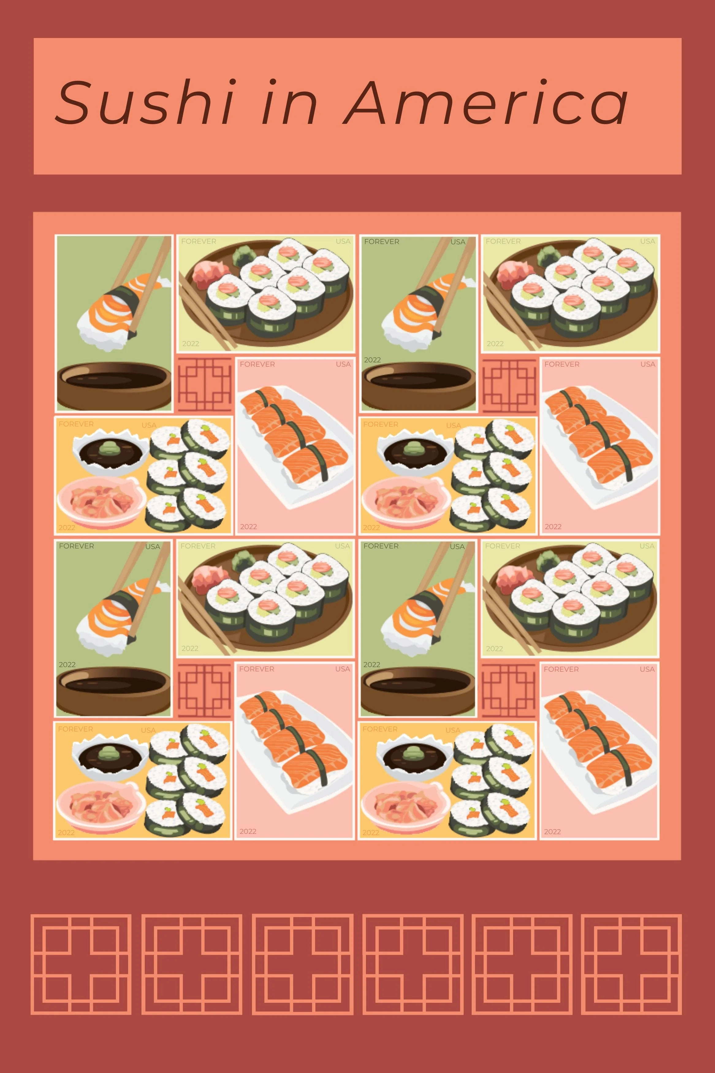
Sushi Stamps
Creating my sushi stamps in Adobe Illustrator blended precision and creativity. I sketched basic sushi shapes, then refined them into smooth, scalable vector graphics with distinct elements. Colors mirrored natural sushi hues, using soft gradients and subtle shadows for depth. The versatile stamps suit digital and print formats, ideal for stationery, packaging, and branding. This project improved my vector skills and appreciation for minimalist food design.
Artifacts Poster
The Illustrator poster highlights artifacts with detailed visuals and informative text, emphasizing their historical and cultural value. It features a clean layout, balanced typography, carefully chosen colors, and layered elements for depth, ensuring readability and a professional look. Overall, it effectively conveys artifacts' significance in human history.
Herbert Bayer Typeface Zine
Ecopaws is a sustainable packaging design that transforms into a functional cat bed, offering a zero-waste solution for pet owners. Crafted from 100% recyclable corrugated cardboard and printed with eco-friendly inks, the packaging securely holds multiple cat toys while easily folding into a cozy, durable bed, combining practicality, playfulness, and environmental responsibility. This project highlights how innovative design can reduce waste while enhancing the customer and pet experience.
Real Estate Instagram Post
I designed a real estate Instagram post for a client to boost online presence and attract buyers in Canva. It features a clean layout with high-quality images highlighting spacious interiors, updated appliances, and a prime location. The neutral, professional color scheme maintains brand consistency while emphasizing key details. This design balances visual appeal and informative content for effective real estate marketing.
Porch Light Living Logo
The Porch Light Living logo blends a light and a house, symbolizing guidance, warmth, and safety. The logo for Porch Light Living was created in Adobe Illustrator. This clear, simple design reflects the brand’s mission to provide comfort in home spaces, making it memorable and inviting.